Bird Icons
In this project I was challenged to make six designs that while different still followed a coherent theme. They all need to look like they fit together. I created these designs by using Adobe Illustrator.
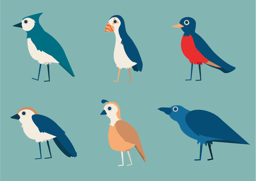
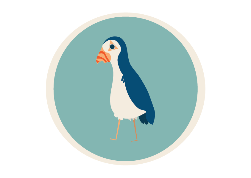
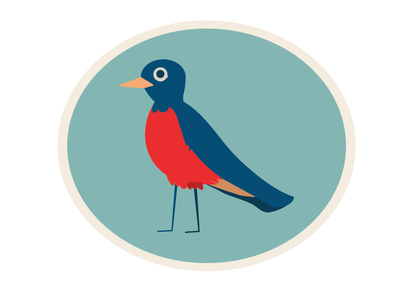
These six icons were inspired by birds. They took me about two weeks to make. I went from sketching up pictures to opening Adobe Illustrator and creating the icons. This was my first big project using a Illustrator and the first time falling in love with the program.
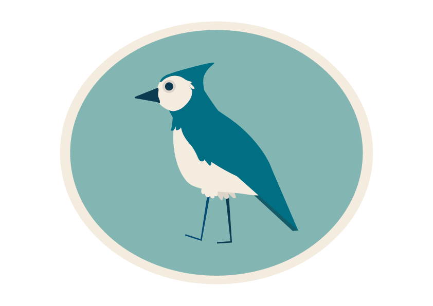
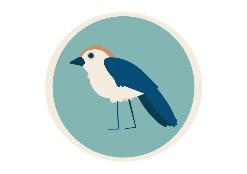
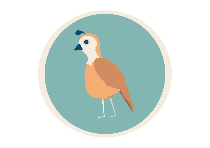
Blue Jay
This Blue jay is The first of my Bird Icons.
Chickadee
Partridge
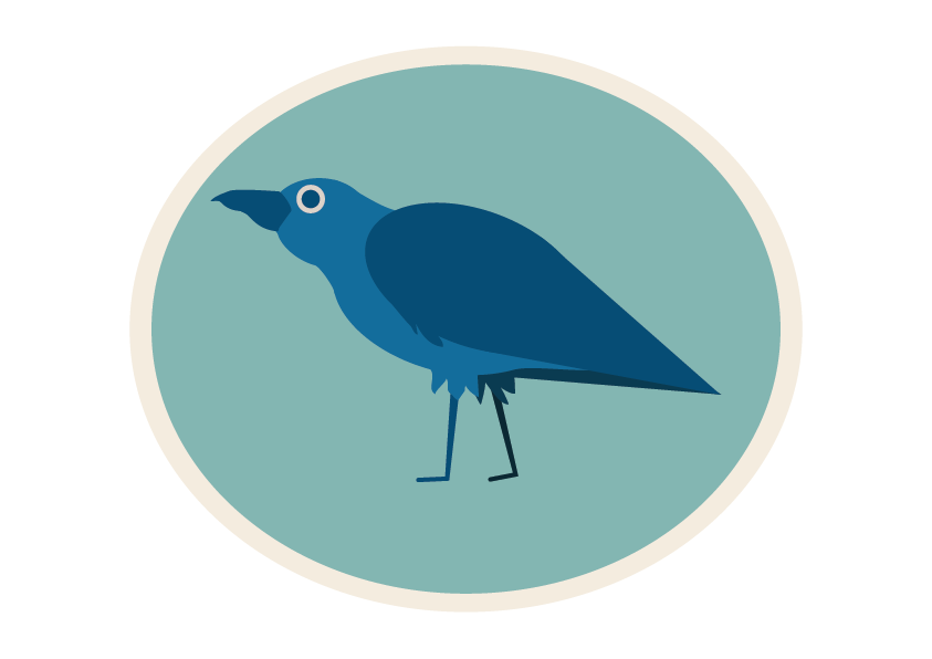
Raven
Puffin
Robin
Watch Project
In this project I was challenged to make six designs that while different still followed a coherent theme. They all need to look like they fit together. I created these designs by using Adobe Illustrator.
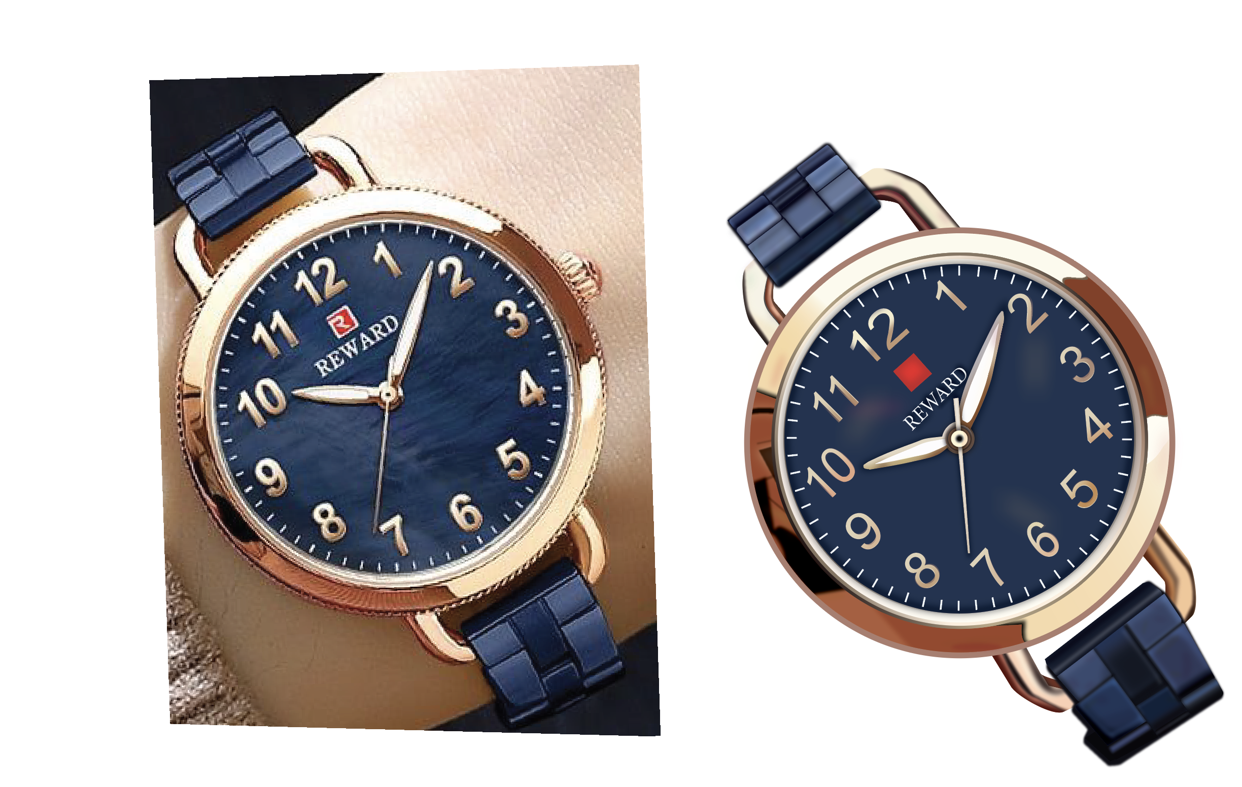
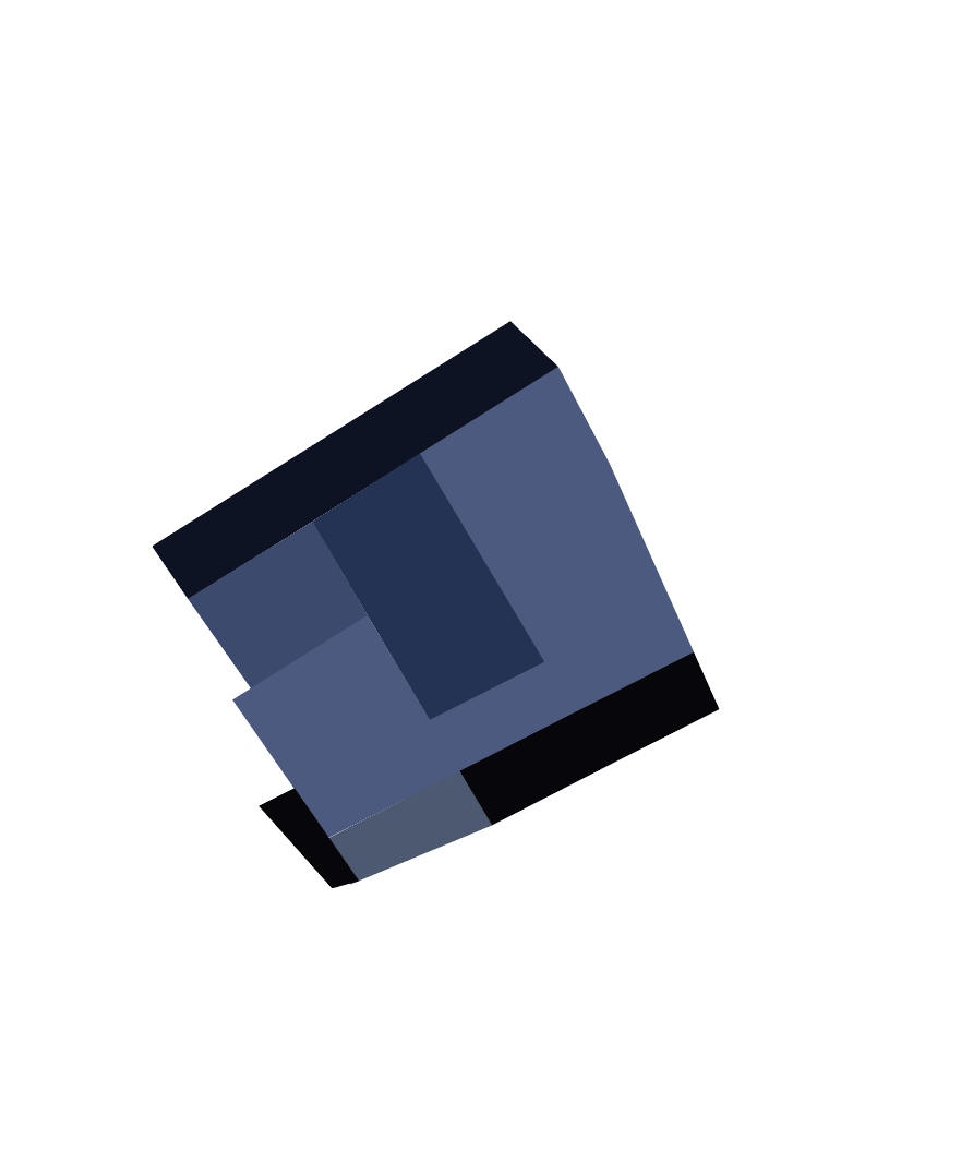
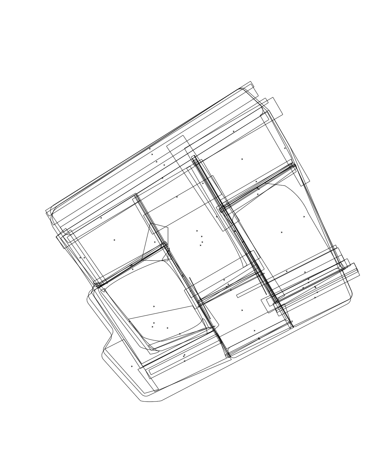
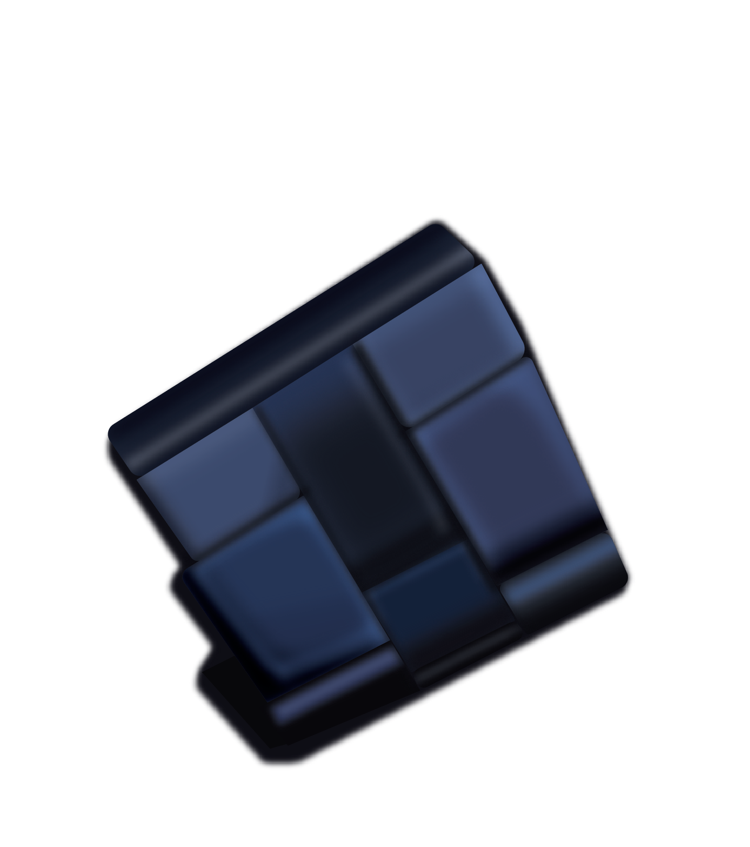
This project was probably the hardest that I had to do for my vector graphics class. I had to complete a direct realistic copy of a watch. This took me over 40 hours to complete.
Gig Poster
In this project I was challenged to make six designs that while different still followed a coherent theme. They all need to look like they fit together. I created these designs by using Adobe Illustrator.
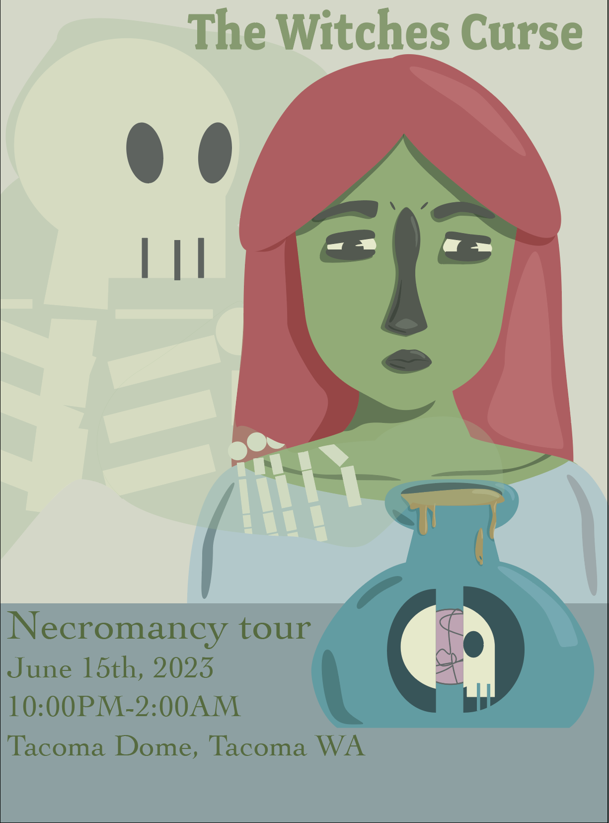
I was given the challenge to create a gig poster for a fake band. I worked on creating a cohesive and interesting concept. I wanted to make a poster for a more grundy band. I chose colors that would cause the main character to be the focal point of the poster.
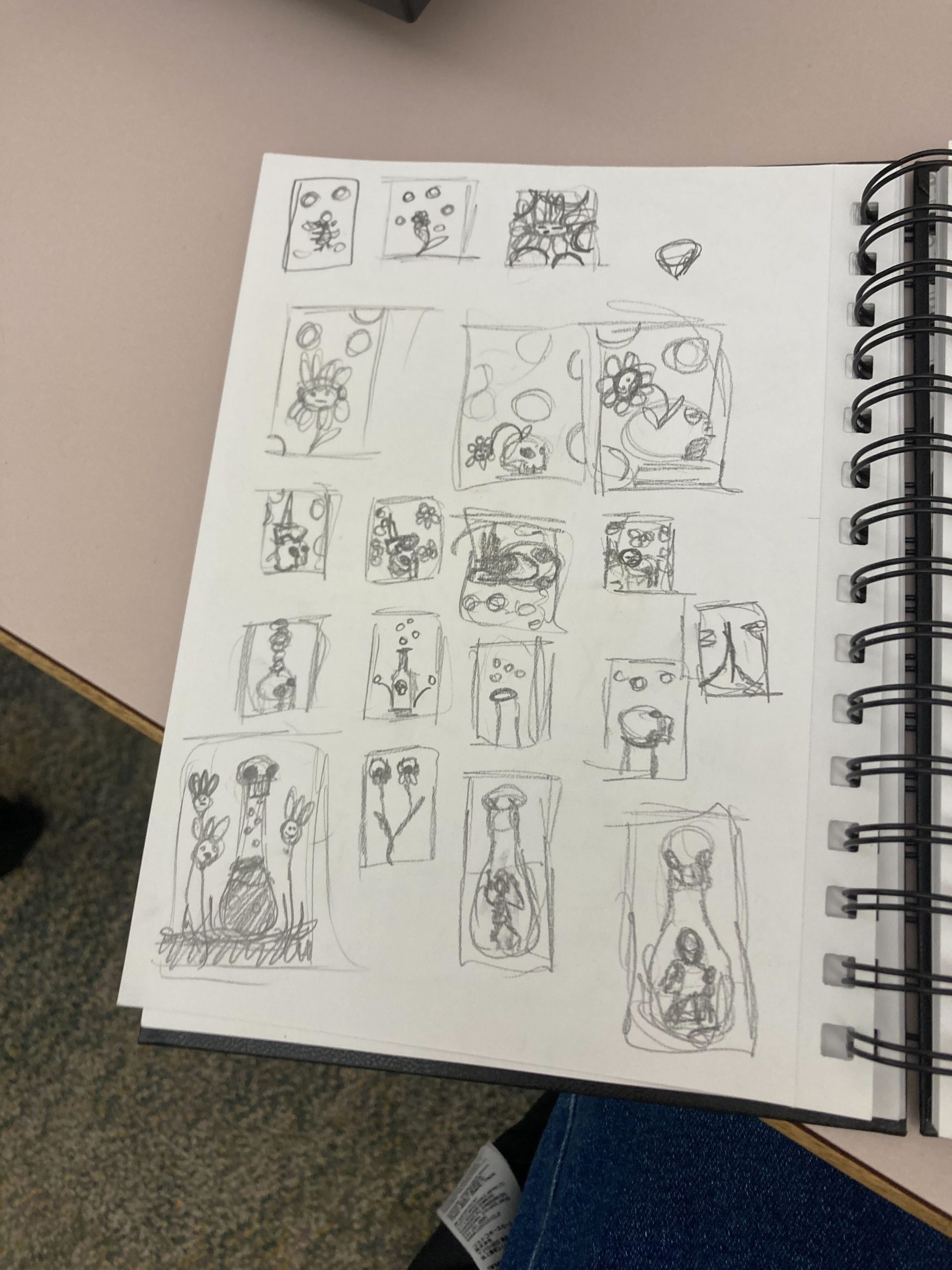
This is my sketches for this project. I was playing around with a few different ideas. I knew I wanted to create a more grundgy poster.
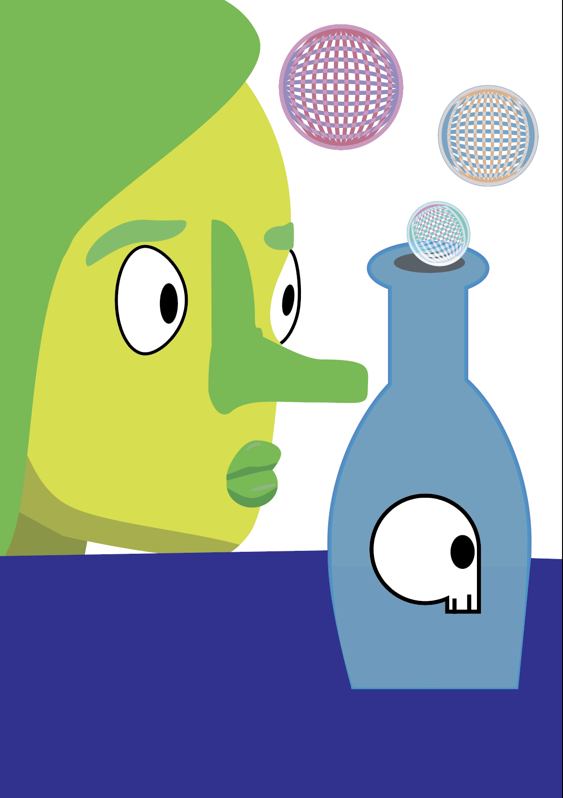
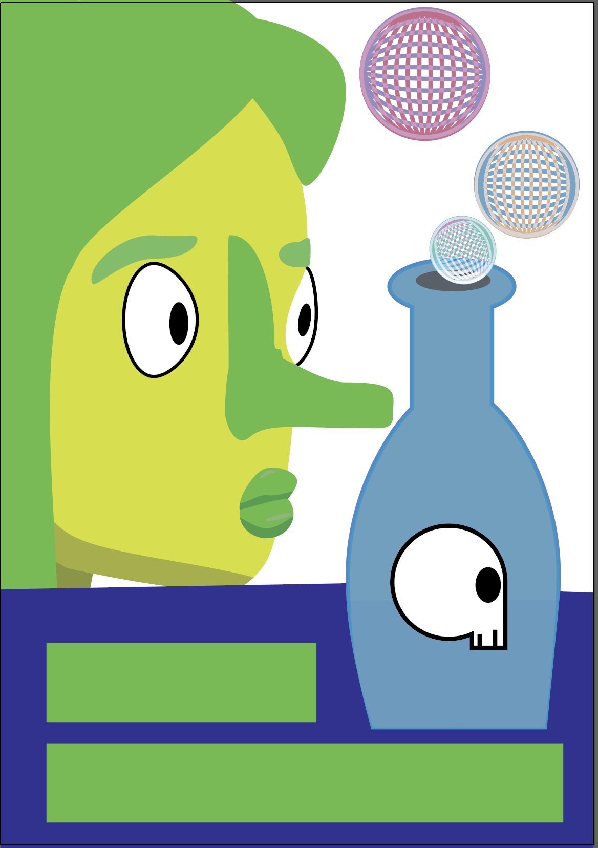
This is my first draft on adobe Illustrator. I was trying a few things with design but didn’t really love the way I was going with it.
I kept trying to change things but I realized that I didn’t like how the poster was laid out. So I scrapped this layout and created a new one.
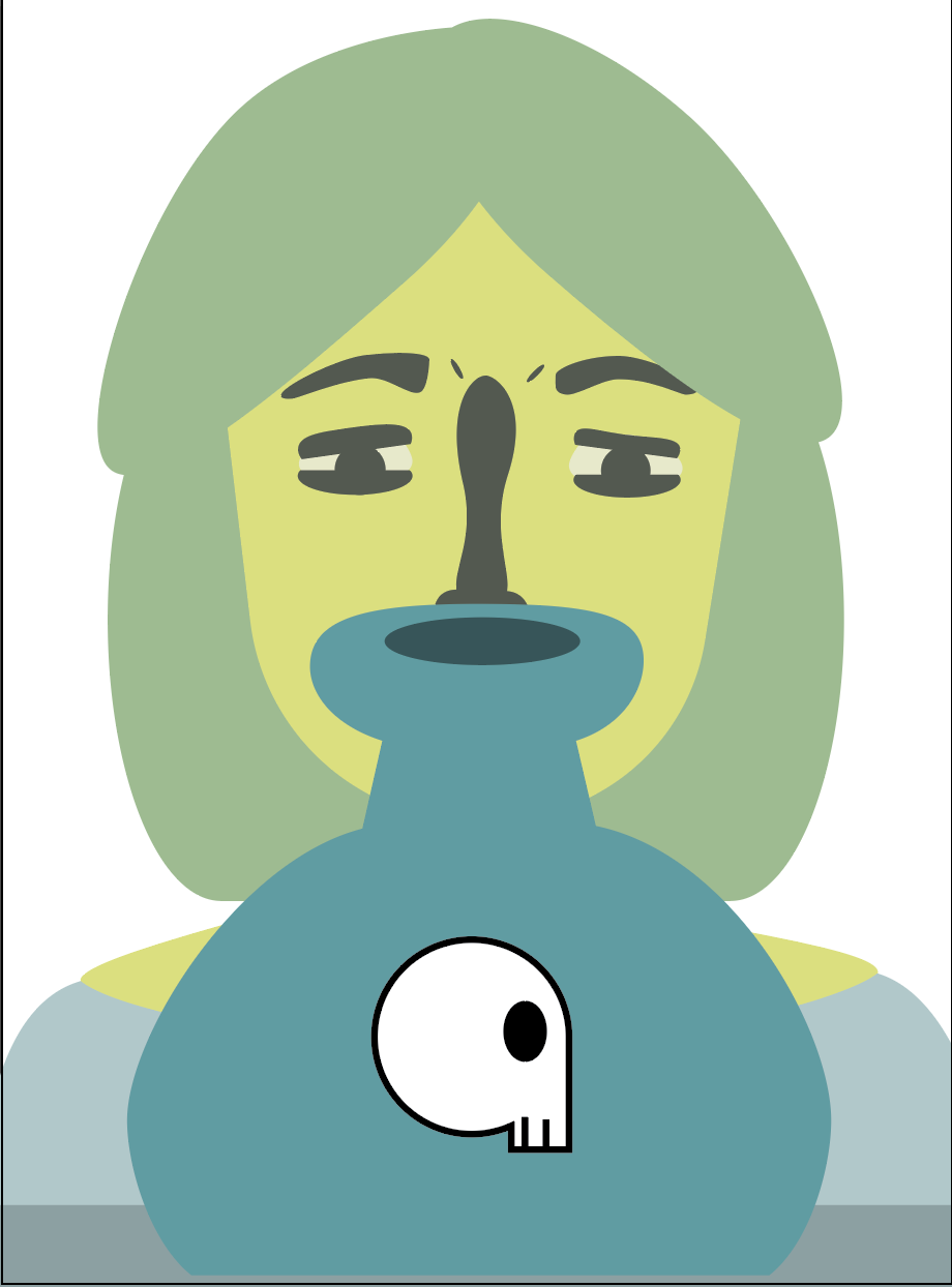
I was a lot happier with this layout of my project. Having the character face forward in the poster made the angling of everything else easier.
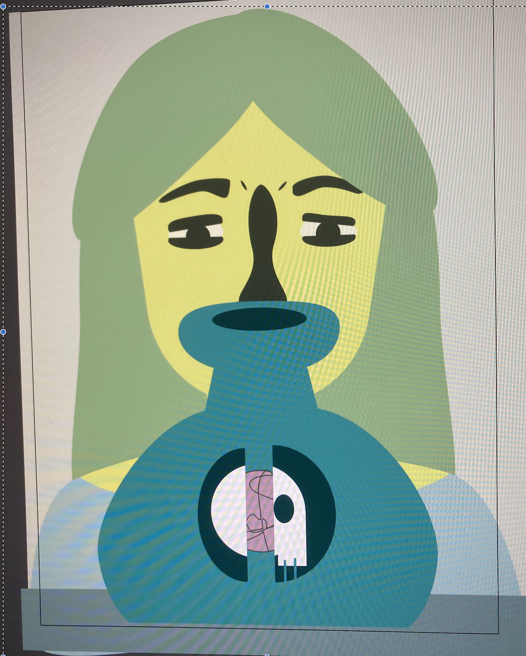
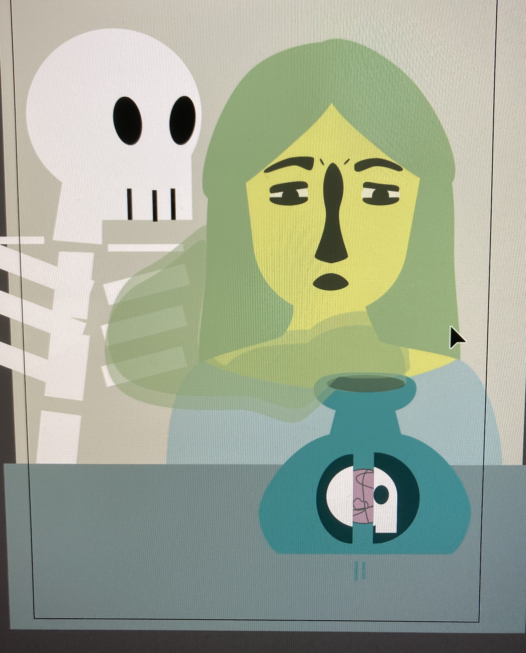

I worked more on the vial in front of my witch. I was still trying to figure out if I wanted something coming out of the vial or if I wanted to leave the vial alone.
I added green smoke coming out of the vial and a skeleton in the background. This made the design a little more busy than I wanted it. I shrunk the witch down and that fixed the spacing. My design didn’t feel super cohesive to me.
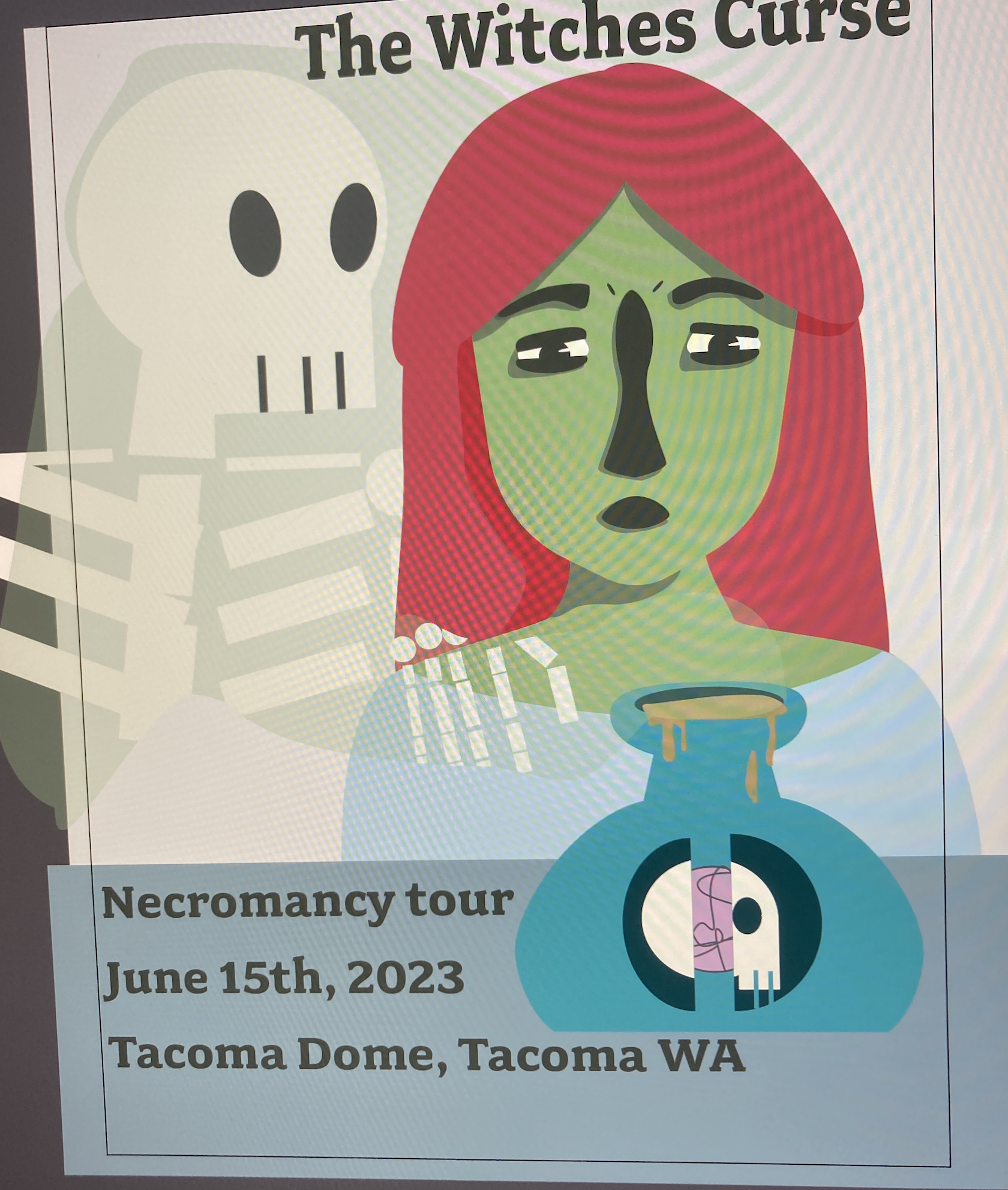
I created a more cohesive design by having the smock leaving the vial create the skeleton. I also added some typography.
This is the final product. I enjoyed creating this project. I think I would change the typography now that I have more experience.
Bug Icons
In this project I was challenged to make six designs that while different still followed a coherent theme. They all need to look like they fit together. I created these designs by using Adobe Illustrator.
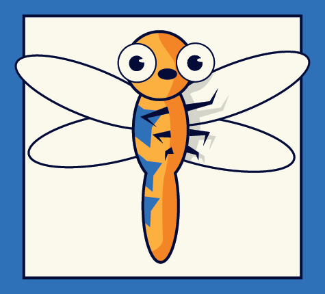
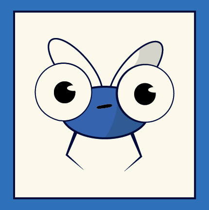
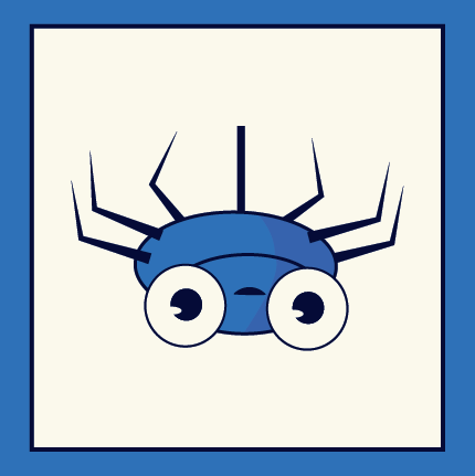
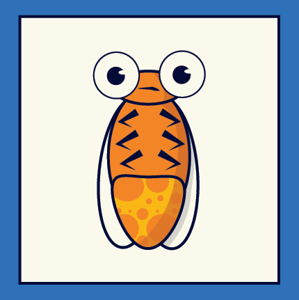
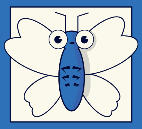
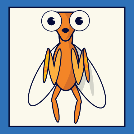
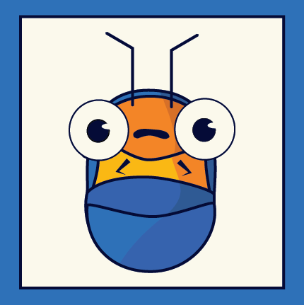
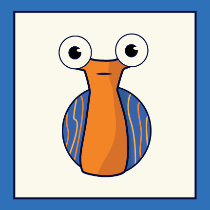
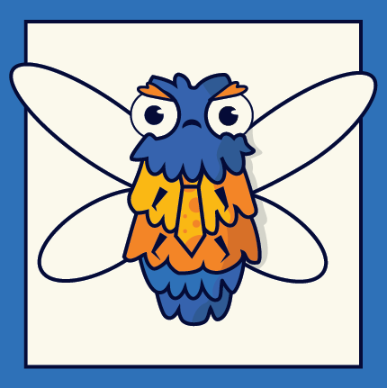
These Icons were made for my Vector Graphics class. I was challenged to make 12 cohesive Icons. I chose to create bugs with big cute eyes. Well the designs are Similar in some ways I tried to make the bugs each have there own character to them.
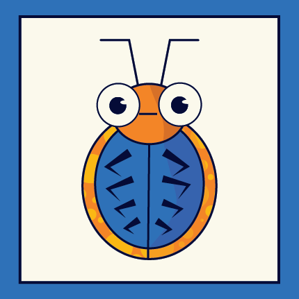
Ladybug
Dragon Fly
Fly
Spider
Fire Fly
Butterfly
Praying Mantis
Rollie Pollie
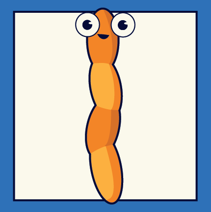
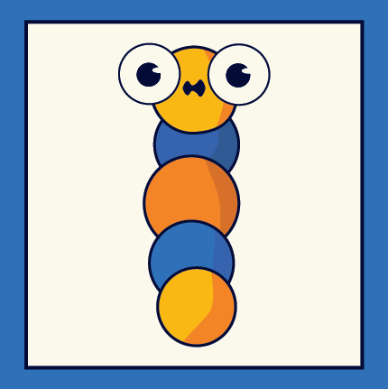
Worm
Snail
Caterpillar
Moth
Sticker Project
In this project I was challenged to make six designs that while different still followed a coherent theme. They all need to look like they fit together. I created these designs by using Adobe Illustrator.
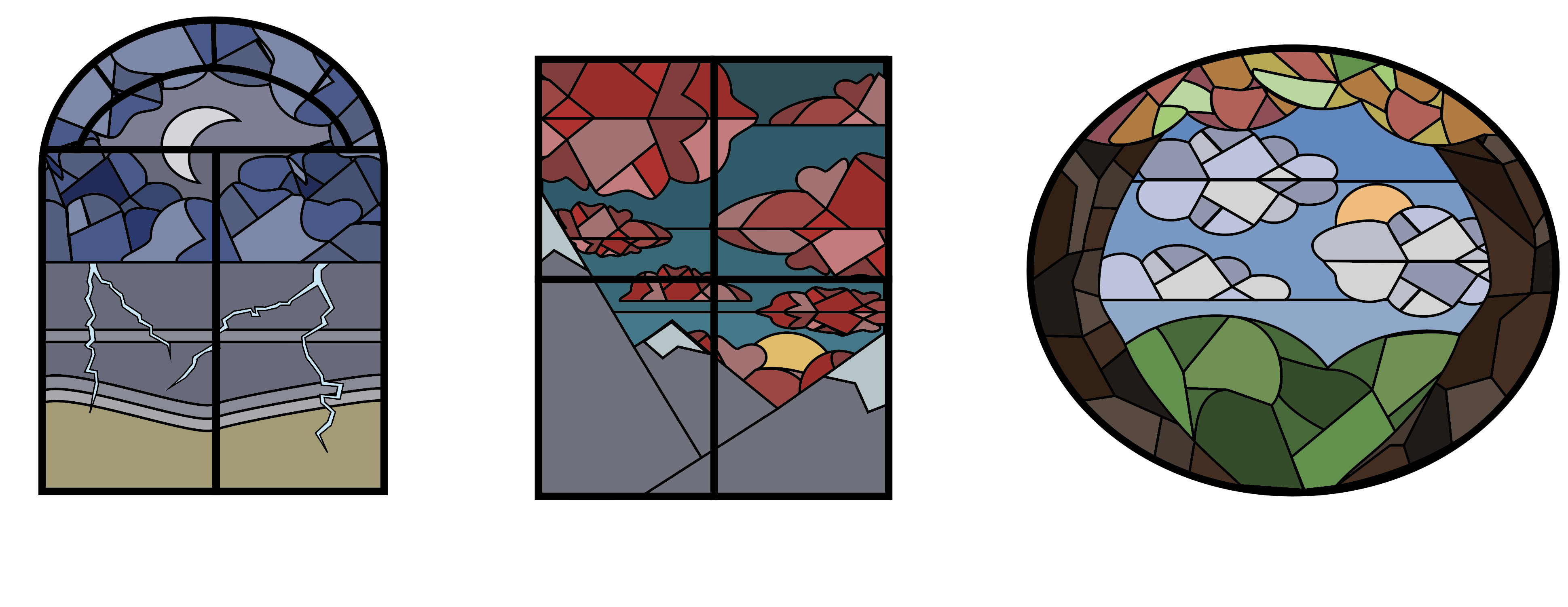
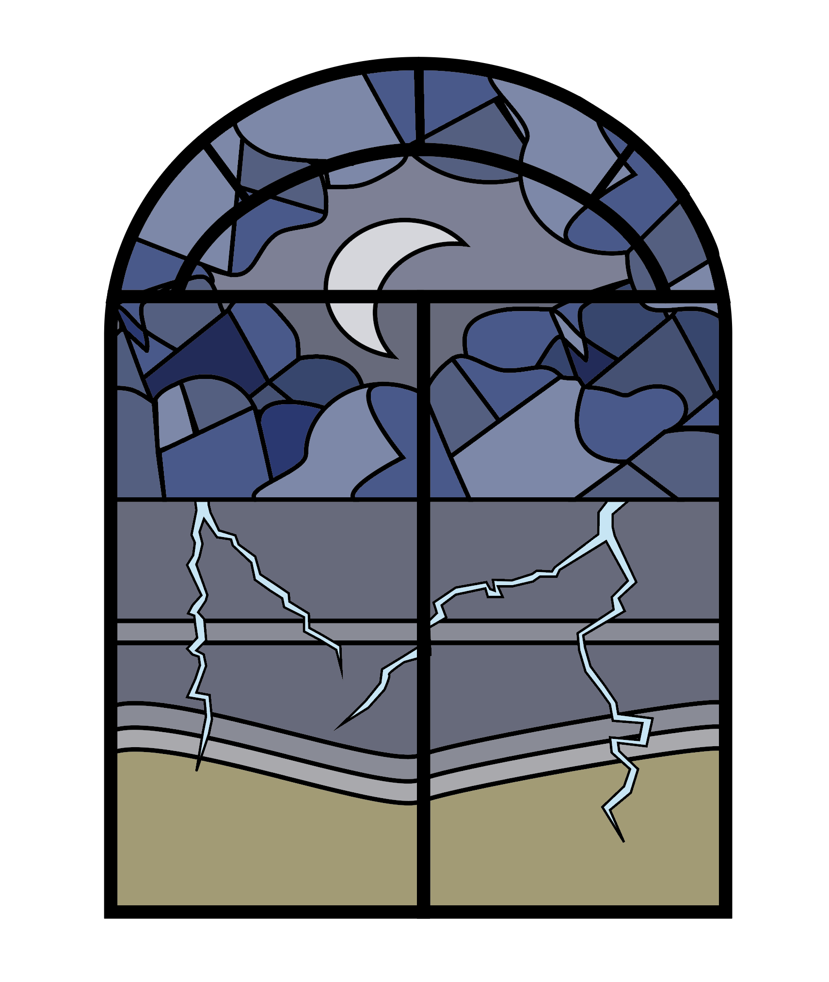
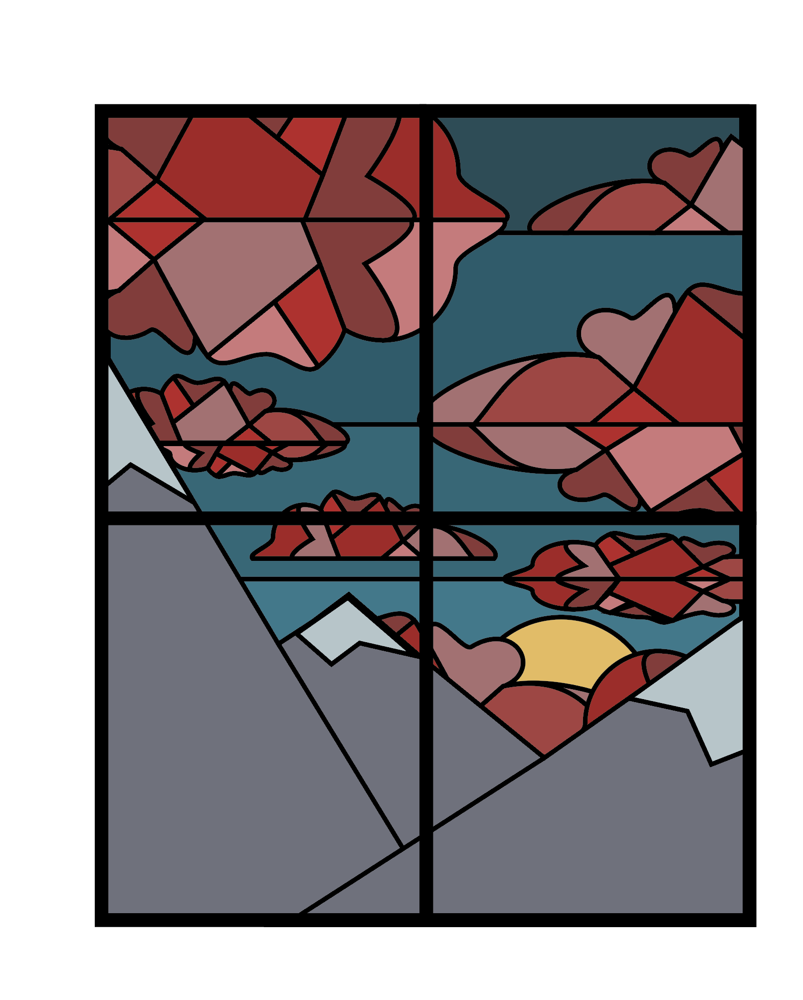
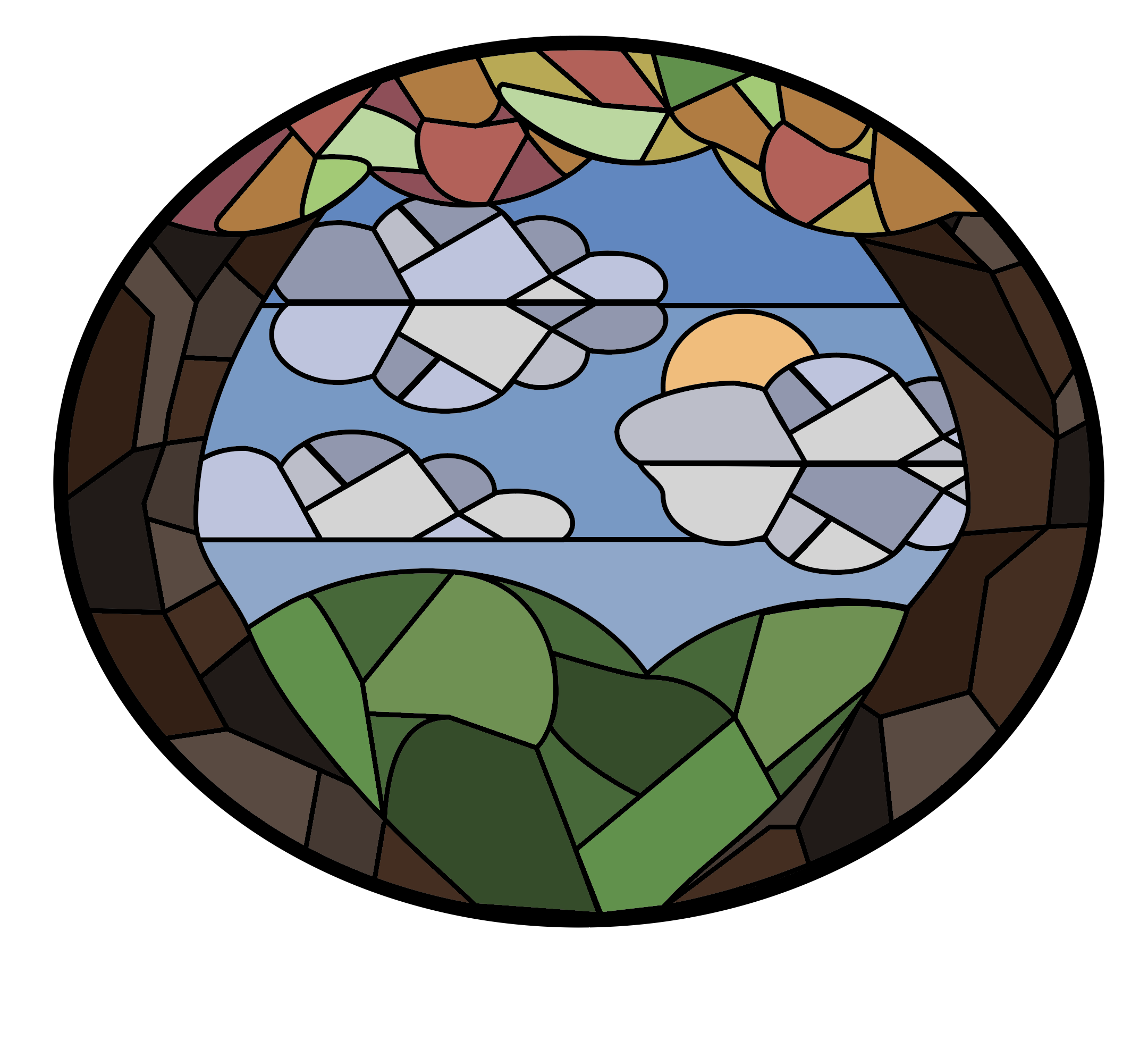
My goal was to create a three designs that i felt were strong enough to become stickers. I replicated the look of stained glass.
